
In Part 1, we established the design system compliance problem. Now let’s solve it for 98% of cases using class overrides alone.
Class names let you replace the CSS classes on your form components without touching the HTML structure. This is faster, less fragile, and easier to maintain than template-level customization. Start with this method in every case, and only reach for template overrides if you can’t accomplish your design goals with classes alone.
What Is the Class Names Method?
Form.io templates are built from components, and each component has named parts: input, label, button, and so on. Class names let you define exactly which CSS classes apply to each part. The HTML structure stays the same; only the classes change. Because you’re working at the class level, this approach works with any CSS framework, whether you’re using Tailwind, Bootstrap, or something entirely your own, so you’re never locked into a particular toolchain.
Before You Start
This guide assumes you already have a working Form.io application using the @formio/js renderer. To add the Standard Template, install it from npm:
npm install @formio/standard-templateNote: The Standard Template is a new and actively evolving package. Check the GitHub repository for the latest version and API details before adopting it in production.
The Structure
Here’s what a theme definition looks like:
import { standardTemplate } from '@formio/standard-template';
import type { TemplateClasses } from '@formio/standard-template';

const myTheme: TemplateClasses = {
  // Component definitions go here
};

Formio.use(standardTemplate('my-custom-theme', myTheme));
Each component you want to customize gets an entry, and each entry defines classes for different contexts (form mode versus html display mode) and for the different parts of that component. Once you’ve seen one component defined, the rest follow the same shape.
Building a Complete Theme
Let’s build a complete theme from scratch using Tailwind classes, transforming a basic contact form to match a modern design system. We’ll add one piece at a time.
Our goal:
- Minimal, underline-style input fields with an accent focus state
- Small, uppercase labels in the accent color
- A gradient pill button with hover effects
- Comfortable spacing between fields
Step 1: Input Fields
const myTheme: TemplateClasses = {
  input: {
    form: {
      input: [
        'block',
        'w-full',
        'px-0',
        'py-2.5',
        'text-base',
        'text-slate-800',
        'bg-transparent',
        'border-0',
        'border-b-2',
        'border-slate-300',
        'focus:outline-none',
        'focus:border-violet-600',
        'placeholder:text-slate-400',
        'transition-colors',
        'duration-200'
      ]
    }
  }
};
Pause on the shape of that definition, because every other component follows it:
input(the outer key) is the component type: text fields, email fields, and so onformis the context (edit mode; there’s also html for read-only display)input(the inner key) is the specific element within that component- The array contains all the Tailwind classes applied to that element
The result is an underline-style input: no box, no background, just a bottom border that shifts to violet when the field has focus.
Step 2: Add Labels
const myTheme: TemplateClasses = {
  label: {
    form: {
      label: [
        'block',
        'text-xs',
        'font-bold',
        'uppercase',
        'tracking-wider',
        'text-violet-600',
        'mb-2'
      ]
    }
  },
  input: {
    // ...input classes from Step 1
  }
};
Labels now have their own styling: small, bold, uppercase, with letter-spacing and the accent color picking up the same violet as the input focus state. This sits alongside the input definition rather than inside it, because labels and inputs are independent components.
Step 3: Add Buttons
const myTheme: TemplateClasses = {
  button: {
    form: {
      button: [
        'w-full',
        'px-6',
        'py-3',
        'text-sm',
        'font-bold',
        'uppercase',
        'tracking-wider',
        'text-white',
        'bg-gradient-to-br',
        'from-violet-600',
        'to-violet-700',
        'rounded-full',
        'shadow-lg',
        'shadow-violet-600/30',
        'cursor-pointer',
        'transition',
        'duration-150',
        'hover:opacity-90',
        'hover:-translate-y-px',
        'disabled:opacity-50',
        'disabled:cursor-not-allowed'
      ]
    }
  },
  label: {
    // ...label classes from Step 2
  },
  input: {
    // ...input classes from Step 1
  }
};
The button becomes a full-width gradient pill: violet gradient background, a soft glow shadow, a subtle lift on hover, and proper disabled states. Notice the pattern: each component is self-contained, and adding a new one never disturbs the others.
Step 4: Add Field Spacing
const myTheme: TemplateClasses = {
  component: {
    form: {
      component: [
        'mb-6'
      ]
    }
  },
  button: {
    // ...button classes from Step 3
  },
  label: {
    // ...label classes from Step 2
  },
  input: {
    // ...input classes from Step 1
  }
};
The component entry wraps every field in the form, so a single mb-6 here gives each field comfortable breathing room below it. That’s the last piece of the theme.
The Complete Theme
Here’s the full theme definition:
import { standardTemplate } from '@formio/standard-template';
import type { TemplateClasses } from '@formio/standard-template';

const myTheme: TemplateClasses = {
  label: {
    form: {
      label: [
        'block',
        'text-xs',
        'font-bold',
        'uppercase',
        'tracking-wider',
        'text-violet-600',
        'mb-2'
      ]
    }
  },
  input: {
    form: {
      input: [
        'block',
        'w-full',
        'px-0',
        'py-2.5',
        'text-base',
        'text-slate-800',
        'bg-transparent',
        'border-0',
        'border-b-2',
        'border-slate-300',
        'focus:outline-none',
        'focus:border-violet-600',
        'placeholder:text-slate-400',
        'transition-colors',
        'duration-200'
      ]
    }
  },
  button: {
    form: {
      button: [
        'w-full',
        'px-6',
        'py-3',
        'text-sm',
        'font-bold',
        'uppercase',
        'tracking-wider',
        'text-white',
        'bg-gradient-to-br',
        'from-violet-600',
        'to-violet-700',
        'rounded-full',
        'shadow-lg',
        'shadow-violet-600/30',
        'cursor-pointer',
        'transition',
        'duration-150',
        'hover:opacity-90',
        'hover:-translate-y-px',
        'disabled:opacity-50',
        'disabled:cursor-not-allowed'
      ]
    }
  },
  component: {
    form: {
      component: [
        'mb-6'
      ]
    }
  }
};

// Apply it globally
Formio.use(standardTemplate('my-custom-theme', myTheme));
Apply this once when your application initializes, and every form in your application will use the styling.
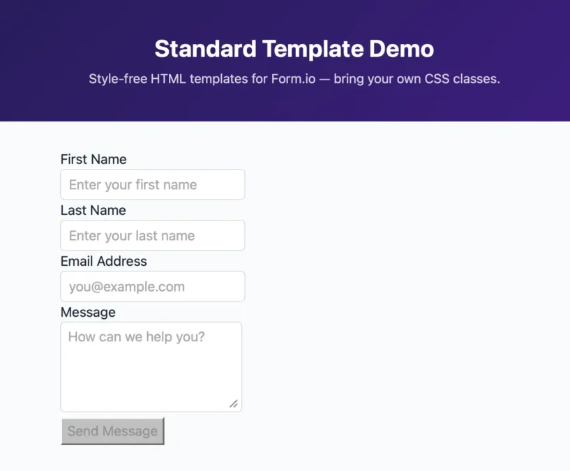
Before:
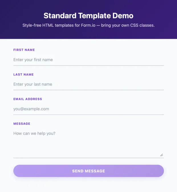
After:
Next Steps
You now have everything you need to style Form.io forms to match your design system using class overrides. From here, the work is mostly a matter of breadth. The same pattern extends to every other component:
- Radio buttons and checkboxes:
radio,checkbox - Select dropdowns:
select - Text areas:
textarea - Error and help text:
errorLabel,helpBlock - Field containers:
component,field
In every case you define classes for the component type and its parts, exactly as we did above. A textarea, for example, would take the same underline treatment as the inputs, plus resize-y and a min-h-20 so users can expand it comfortably.
As your themes grow, it helps to pull them into their own modules so you can reuse them across projects:
// themes/tailwind-modern.ts
export const tailwindModern: TemplateClasses = {
  // Your theme definition
};

// app.ts
import { tailwindModern } from './themes/tailwind-modern';
Formio.use(standardTemplate('tailwind-modern', tailwindModern));
Do this consistently and you end up with a library of themes you can share across your organization and maintain as part of your design system.
Additional Resources
- Standard Template Playground: Interactive examples of different themes and styling approaches
- GitHub Repository: Inspect the code and learn more about what you can target with CSS


